Your event page is your most important piece of marketing in your promotional mix. Most ticketing systems, whether managed or DIY, allow you a certain degree of customization for your event page. While you may be tempted to just throw your page up and start selling tickets as soon as you can, fight the urge!
Even if you have a dedicated website for your event you should still think of your event page as a mini advertisement. You never know how people are going to link to your event. If someone links directly to your ticketing page you’ll want to make sure you still have enough engaging information to get potential attendees excited about your event and ready to purchase their tickets.
I’ll show you some ways you can spice up your event page. Naturally, I’ll be using our platform Freshtix in the examples. Not all software will offer the same capabilities but most should be standard.
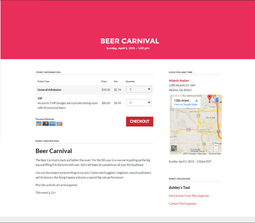
Here is a basic event page. This is what your event page will look like if you’re one of those “bare minimum” kind of folks.
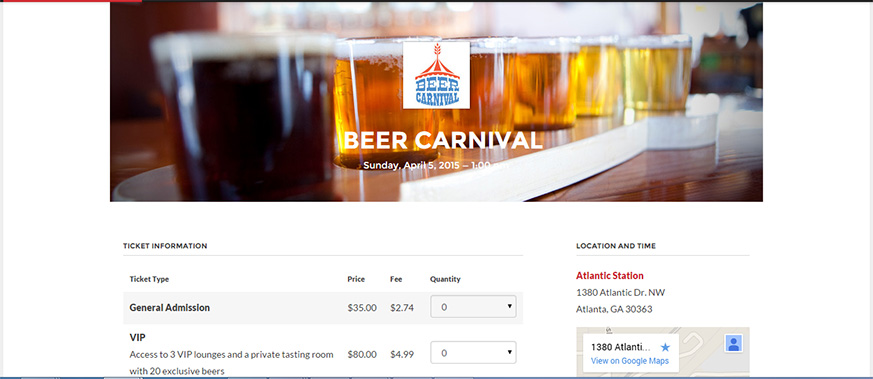
Not very exciting is it? Well first off, if you’re using Freshtix you’ll want to take advantage of the header customization. You can add an event logo, a header image, or a color overlay (or two, or all three). We are visual people after all! Let’s try including an image and logo in the header (read more about how to do this here):
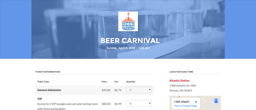
Yeah buddy, now we’re getting somewhere! You can also add a color overlay to the header in any color your little heart desires.
Ok now that that’s done lets talk about what you can put in your event description to spice it up a little bit. Depending on what kind of event you’re listing you have a ton of options here. I’ll show you some examples.
The Draw
Make sure you’re really selling your events. Are you going to have a musical guest? Who is it? Are there going to be special prizes? Will there be something new an exciting to see this year? Take this opportunity to tell people what fun and surprising experiences they can expect from your event.
Utilize that WYSIWYG
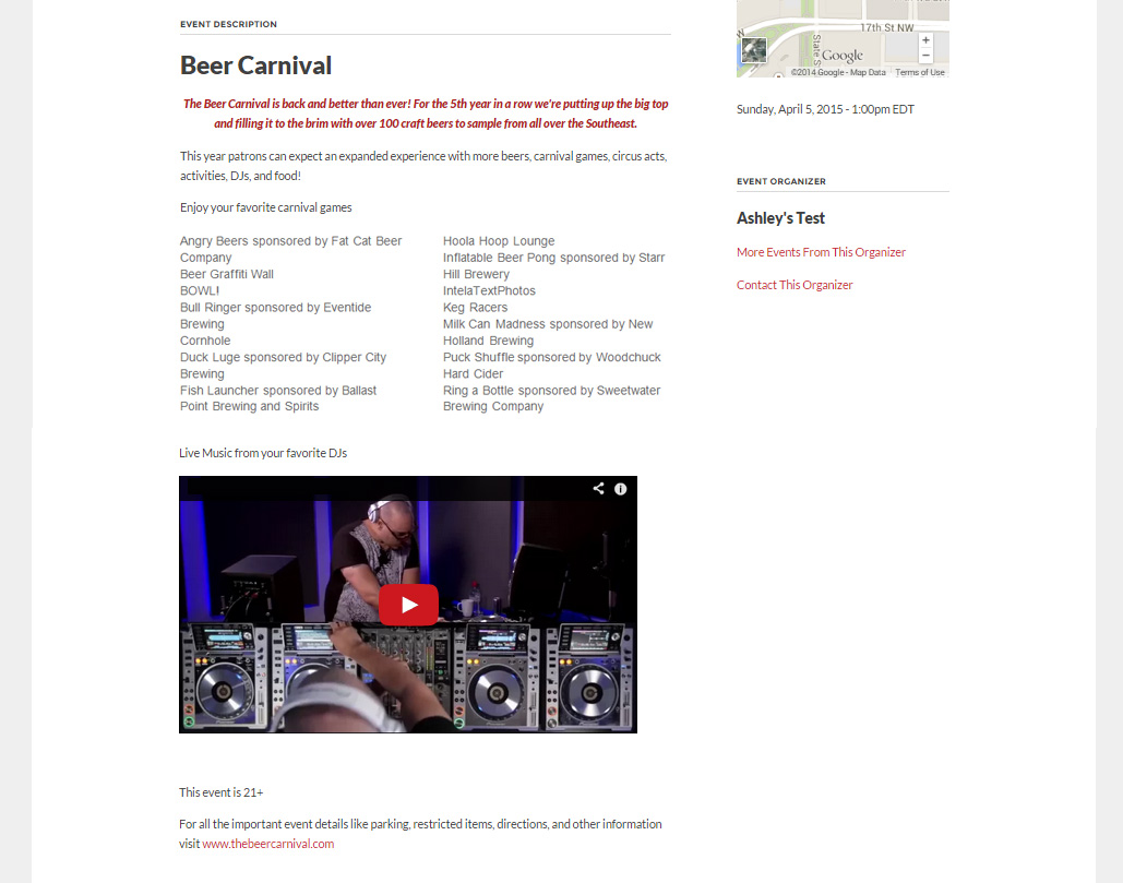
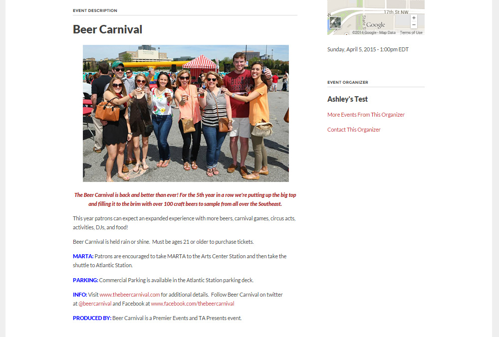
Many platforms have some form of a WYSIWYG editor. In the example below I added a little splash of color and I used a table tool to house a large chunk of information. Format yourself silly, we won’t judge.
Video
One thing that marketers will tell you over and over (at least right now until the next trend) is that video is extremely powerful. If you have a video from your event’s previous year definitely use it. Or if your event involves music include videos of the artists that are expected to perform. If you’re hosting a speaker, include some videos of former engagements. Anything that your potential attendee can watch and say, I just have to be there.
Images
Images are the next best thing to video. Use some stock imagery or images from past events to give life to your page.
Key Details
Perhaps less exciting but equally as useful are event details. Tell your attendees where to park, any ticket price increases to expect, what time doors open, a list of prohibited items, you get the point.
So there’s some basics. Don’t feel like you have to do it all at once. If you need some inspiration just save your event page and come back to it later. Rome wasn’t built in a day.
What fresh ideas have you seen for event pages? Share your suggestions in the comments or go find us wandering around social media!

0 Comments